
Steps To Build A Professional Next.js Portfolio
With Tailwind CSS


Overview
In this blog I am going to explain all necessary steps to create a multiple pages portfolio/website using React, Next.js and Tailwind with JavaScript.
Hope you enjoy it !
React And Next.js
React is a JavaScript library for building user interfaces.
Next.js is a popular and lightweight framework for applications built with React. We will use Next.js because its preferable when dealing with or building multiple pages, server-rendered websites.
Tailwind
Tailwind CSS works by scanning all of your HTML files, JavaScript components, and any other templates for class names, generating the corresponding styles and then writing them to a static CSS file.
Requirements
Node.js / npm
npm is the world's largest software registry (Library).
To be able to start/build a React project; you should have npm installed. if not; review the Installation guide here.
Note: You should have Node.js to be able to install npm
Initialization
Create a GitHub repository
After creating a new repository on GitHub, open you terminal and clone it to your local device. Then navigate to that repo to create your React app inside it.
Create a Next.js app
- Run the following command:
npx create-next-app <name of your app here>

// I chose "portfolio" as the name of my app:
npm create-next-app portfolio
Run your app
- To start the project and run the following command to run the server:
npm start
npm run dev
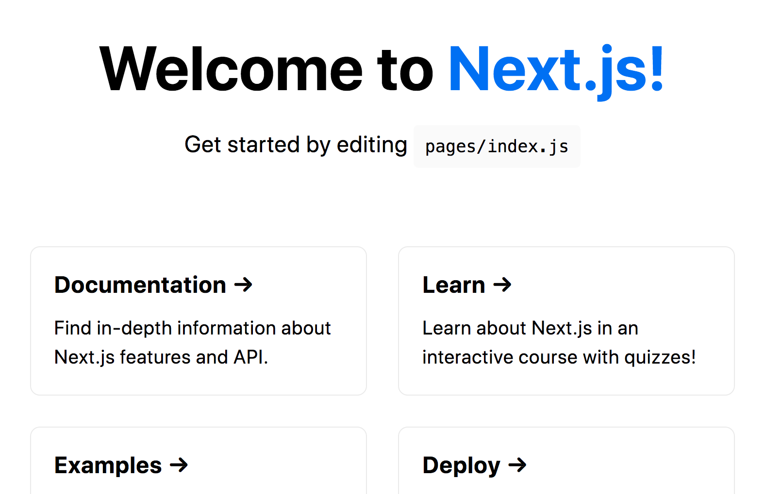
This command will start your Next.js app’s "development server" on port 3000.
Now you should be able to see this page:
Install Tailwind
- Run these command:
npm install -D tailwindcss
npx tailwindcss init
Setup
- Open your code on Vscode.
When installing Tailwind, you should add/make some changes:
1. in the tailwind.config.js file, add this inside the content:
module.exports = {
  content: ["./src/**/*.{html,js}"],
  theme: {
    extend: {},
  },
  plugins: [],
}
2. Add the Tailwind directives to your CSS, in styles/global.css:
@tailwind base;
@tailwind components;
@tailwind utilities;
3. Start the Tailwind CLI build process by running the following command:
npx tailwindcss -i ./src/input.css -o ./dist/output.css --watch
- Now you can move to pages/index.js and delete its content to get started with new customized one!
Recommended Extensions
ES7+ React/Redux/React-Native snippets This will make it easier and faster for you to create components functions (you only type rfce and press enter)
Prettier - Code formatter It enforces a consistent style by parsing your code and re-printing it with its own rules that take the maximum line length into account, wrapping code when necessary.
Tailwind CSS IntelliSense This will help you a lot when you start styling with tailwind, it provides suggestions and auto completion.
Global Styling
There are some fixed styling properties that we want to be applied on all our app components, such as the background color, the font size and type.. we can specify these properties inside the styles/global.css file using tailwind CSS format:
html {
  scroll-behavior: smooth;
}
@layer base {
  body {
// this means gray background in shade 100, gray text of shade 500
// and wide spacing will be applied on all the app.
    @apply bg-gray-100 text-gray-500 tracking-wide
  }

  h1, h2, h3, h4, h5, h6 {
    @apply font-bold
  }

  h1 {
    @apply text-4xl sm:text-5xl md:text-6xl
  }

  h2 {
    @apply text-3xl sm:text-4xl
  }

  li {
    @apply cursor-pointer
  }

  button {
    @apply shadow-xl shadow-gray-400 rounded-full uppercase bg-gradient-to-r from-teal-400 to-teal-800 text-white
  }
}
Components
To be able to create multiple sections for the same page, its easier and more clean to split each components into a separate JavaScript page. We do that by creating a components folder inside pages and start adding each section in a file, to look like the following:
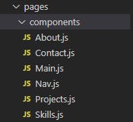
Note: You can delete unused files such as styles/homestyles.css and pages/Api
Nav.js
This component will contain all navigation bar elements. lets start with creating a React component function (this is created for each component):
function Nav() {
  return (
    <div>Nav</div>
  )
}

export default Nav
Now you can start styling the outer div using tailwind CSS like the following:
<div className="fixed w-full h-20 shadow-xl">
// w-full to give it a full width, h-20 for height, an x-large shadow
</div>
Now lets create the container div of our navigation bar inside the main div and give it some basic styling. then we will add a logo as a next.js Image.
You should import Image from 'next/image' to be able to use it, then you have to add the link source in next.config.js file in order for the app to recognize it later for the deployment.
<div className="flex items-center justify-between w-full h-full px-10 2xl:px-16">
<Image
          src="/../public/assets/logo.png"
          alt="logo"
          width="135"
          height="100"
        />
- each time we use Image element, we have to add width,height or layout properties.
Create another div to hold the list of links: here we also used a next.js element which is Link, you should also import Link from "next/link" each time you want to use it in a component.
 <div>
          <ul style="className="hidden md:flex">
            <Link href="/">
              <li className="ml-10 text-sm uppercase border-teal-200 hover:border-b">
                Home
              </li>
            </Link>
            <Link href="/#about">
              <li className="ml-10 text-sm uppercase border-teal-200 hover:border-b">
                About
              </li>
            </Link>
            <Link href="/#skills">
              <li className="ml-10 text-sm uppercase border-teal-200 hover:border-b">
                Skills
              </li>
.... // continue the same for all components
That will be it for the navigation part of our home page! let's start creating the rest of it..
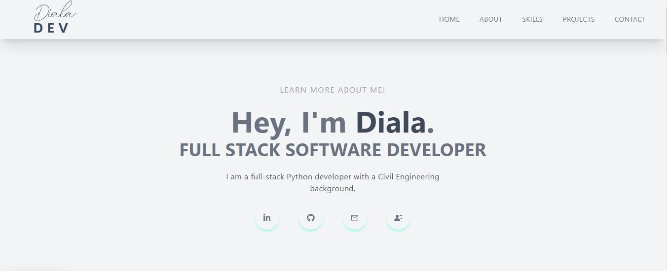
Main.js
This page is supposed to look like this when its finished..
After creating the component function; Let's build the components:
<div className="w-full h-screen text-center">
      <div className="max-w-[1240px] w-full h-full m-auto p-2 flex justify-center items-center">
        <div>
          <p className="uppercase text-sm tracking-widest text-gray-400 py-5 ">
            Learn More About Me!
          </p>
          <h1>Hey, I'm  Diala.</h1>

       <div >
            <h2 className="py-2 text-gray-500 uppercase">
              Full stack Software Developer
            </h2>
            <p className="py-4 text-gray-600 max-w-[70%] m-auto">
              Add your bio
            </p>
Now moving to the links buttons we will use built-in React icons, so import them first:
import { AiOutlineMail } from "react-icons/ai";
import { FaLinkedinIn, FaGithub } from "react-icons/fa";
We can use these icons instead of images for our links. first create a div to contain them:
<div className="flex items-center justify-between max-w-[330px] m-auto p-2">
       </div>
inside that div add a new div for each link passing the link of your social media accounts:
 <div className="p-4 duration-200 ease-in rounded-full shadow-md cursor-pointer shadow-teal-200 hover:scale-125">

                <a href="https://www.linkedin.com/in/dialaabulkhail/">
                <FaLinkedinIn />
                </a>
  </div>
Continue adding a div for each link and that would be it for the Main page.
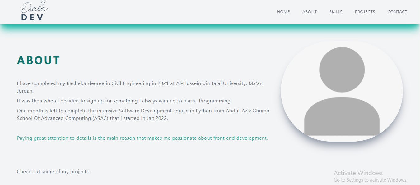
About.js
The about page is quite simple, you only want to divide it into two sections, one to present yourself and the other will be a photo of you -you'll do this by splitting the screen into two columns :
 <div id="about" className="flex items-center w-full p-2 py-16 md:h-screen">
      <div className="max-w-[1240px] m-auto md:grid grid-cols-3 gap-8">
        <div className="col-span-2 ">
          <h2 className="py-10 tracking-widest text-teal-700 uppercase">
            About
          </h2>
          <p className="py-1">
            Add your paragraph here
          </p>

        <div>
          <Image
            className="duration-200 ease-in rounded-full shadow-xl shadow-gray-400 "
            src=""
            width={400}
            height={400}
          />
        </div>
This page will look like this:
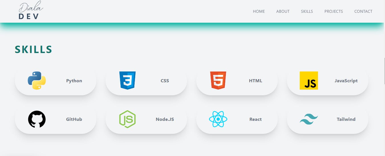
Skills.js
This page is going to be a grid of 4 columns displaying skills in button-shape containing the icon and the name of each one.
first create container div component with the header and style them with the main div:
<div id="skills" className="w-full p-2 lg:h-screen">
      <div className="max-w-[1240px] mx-auto flex flex-col justify-center h-full">
        <h2 className="py-10 tracking-widest text-teal-700 uppercase">
          Skills
        </h2>
        <div className="grid gap-8 md:grid-cols-2 lg:grid-cols-4 ">
Now we can add a div for each skill icon we want to display same as what we did with React icons in Nav.js.
- each div will be exactly like this but with different image source and header:
<div className="p-5 duration-200 ease-in rounded-full shadow-xl hover:scale-105">
            <div className="grid items-center justify-center grid-cols-2 gap-4">
              <div className="m-auto">
                <Image
                  src="https://cdn-icons-png.flaticon.com/512/5968/5968350.png"
                  width="64px"
                  height="64px"
                  alt="github"
                />
              </div>
              <div className="flex flex-col items-center justify-center">
                <h3>Python</h3>
              </div>
            </div>
          </div>
Skills page should look like this:
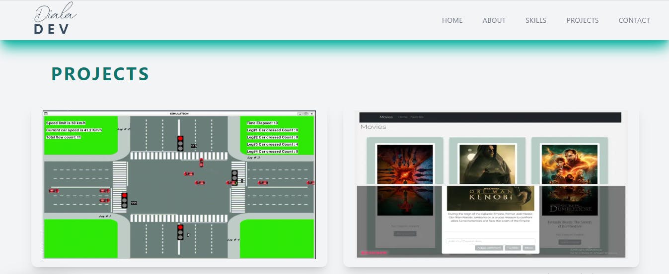
Projects.js
This page is going to be divided into two columns presenting some of the projects I worked on with an hover effect that displays a details button (optional). You can make this by creating routes for new JS files containing some details about each project.
create basic components and style them:
<div id="projects" className="w-full">
      <div className="max-w-[1240px] mx-auto px-2 py-16">
        <h2 className="p-10 tracking-widest text-teal-700 uppercase">
          Projects
        </h2>
        <div className="grid gap-8 md:grid-cols-2">
Same as above, repeat this for each project you want to display:
         <div className="relative flex items-center justify-center w-full h-auto p-4 shadow-xl group rounded-xl hover:bg-gradient-to-r from-teal-600 to-teal-800">
            <Image
              className="group-hover:opacity-10"
              src="/../public/assets/projects/movie.png"
              width="550"
              height="300"
              alt="/"
            />
            <div className="text-white hidden group-hover:block absolute top-[50%] left-[50%] translate-x-[-50%] translate-y-[-50%] ">
              <h3 className="text-2xl tracking-wider text-center">
                Movies Library
              </h3>
              <p className="pt-2 pb-4 text-center">JavaScript</p>
              <Link href="/Movies">
                <p className="py-3 text-lg font-bold text-center text-teal-700 bg-white rounded-lg cursor-pointer ">
                  More
                </p>
              </Link>
            </div>
          </div>
Demo
Deployment
Push and Merge
after finishing everything, commit your work and push it to GitHub and merge it with the main branch.
Deploy on Vercel
The easiest way to deploy your Next.js app is to use the Vercel Platform
Connect your Vercel to GitHub
Import your repository
Deploy !
Next.js deployment documentation
Check out this blog on how to create a portfolio using Html and CSS: shihabiiuc.com/portfolio-website-design-wit..